The UI Codex
When interest in my course for designers dropped, I stopped guessing what it should become. I asked visitors, measured the answers and tested whether anyone would pay. Product, design, code and analytics, solo.
- Role
- Product, design, code and analytics, solo
- Timeline
- February 2025 to July 2026
- Measured with
- Search Console, PostHog, Convex
- Outcome
- Interest measured, no sales yet
It started as a course
The UI Codex started in February 2025 as a paid course for designers on prototyping interfaces in React. I built the authoring system behind it and used the course to train my own team. The bet: a designer who can prototype in code ships better interfaces and waits less on engineers.
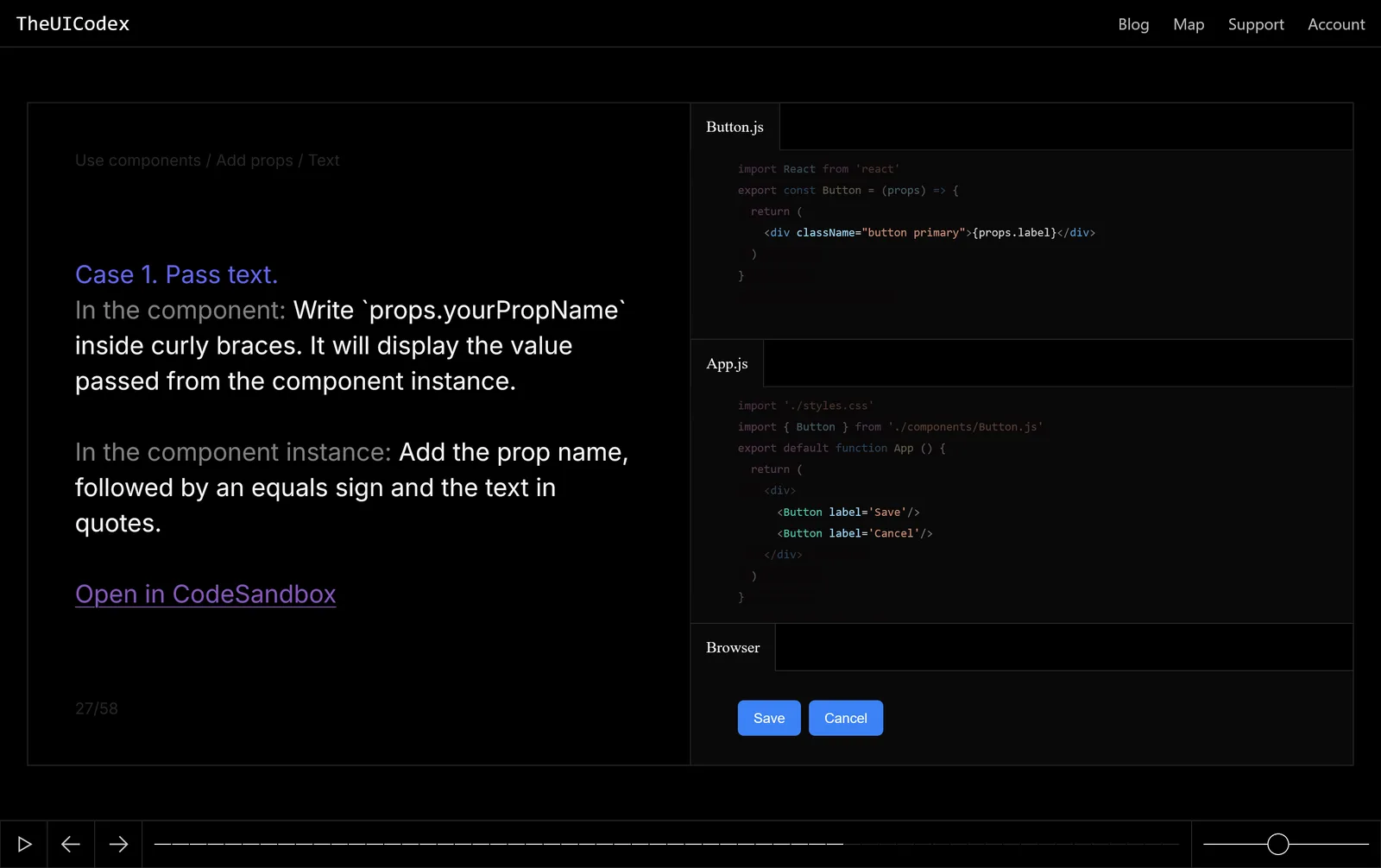
Then interest dropped
During 2025 people stopped buying the course. That was the signal. Coding agents had learned to turn a description into a working interface, so a designer no longer had to write React by hand to prototype. The course taught exactly the part that agents now do.
In March 2026 I removed billing and added product analytics. The site still got search traffic I hadn’t planned for, and I wanted to know who those people were before deciding what to build.
People came looking for something else
Almost nobody was searching for a course. People found the site by its name: they searched for OpenAI’s Codex together with UI design.
| Search | Clicks | Impressions | Position |
|---|---|---|---|
| codex ui design | 55 | 924 | 6.0 |
| codex design ui | 7 | 150 | 5.6 |
| codex for ui design | 6 | 108 | 7.1 |
| codex design | 5 | 158 | 8.5 |
| codex ui | 5 | 649 | 10.2 |
And they left. Of 85 visits from Google to the homepage in those three months, 89% ended on the first page and nobody signed up.
One question on the first screen
In May 2026 I replaced the homepage hero with one question: “What are you looking for?” Each answer was a product that could plausibly sit behind those searches.
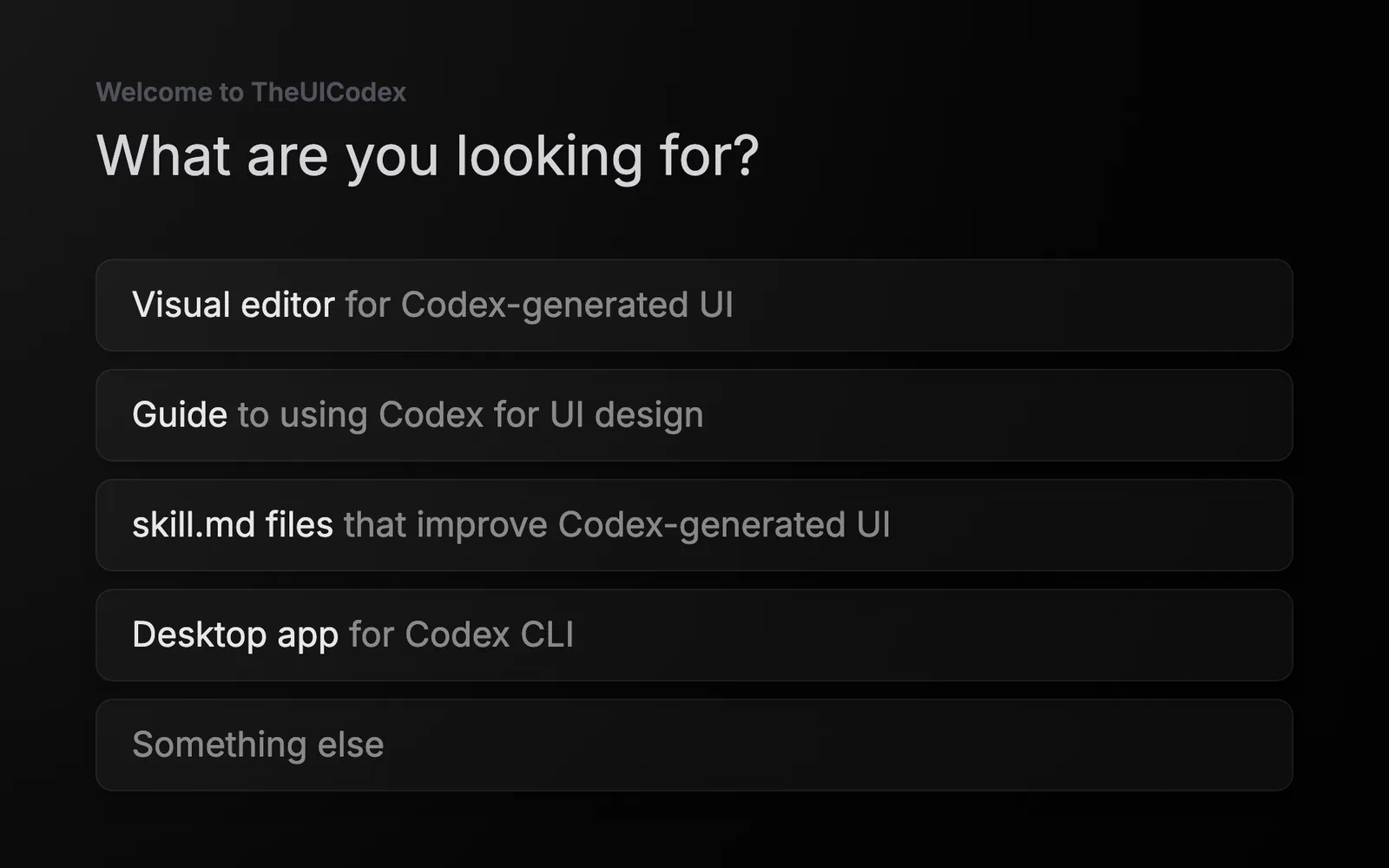
- The order of answers is shuffled for every visitor and the position is logged, so the top option doesn’t win by default.
- Most answers led to a short form: leave an email and hear when it exists. Picking skill.md files opened a page selling the pack instead.
- I set the sample size up front, 100 to 150 answers, and wrote down what each result would mean before opening the data.
What the answers said
By the end of July, 407 people had seen the question and 108 had answered it.
407saw the question
108picked an answer
8left an email
People who picked each answer
- Guide to using Codex for UI design36 · 4 emails
- Desktop app for Codex CLI34 · 1 email
- skill.md files that improve Codex UI34 · 0 emails
- Visual editor for Codex-generated UI26 · 3 emails
- Something else5 · 0 emails
The clicks were a four-way tie, with two people between first and second place. As a way to pick a product, the click was useless, and more traffic would not have broken the tie. Emails said a little more, but eight people over six weeks are too few to split further.
The first analysis was wrong. The only person who had gone all the way through the purchase form picked three files about visual QA for enterprise dashboards, and a product thesis grew out of that. It was my own test run. Since then every number in my notes carries its source, filters and query time, and wrong conclusions go to a list of retractions instead of being deleted.
The Buy button
Picking skill.md files led to a page selling a pack of rules that make Codex-generated UI look production-ready. The main button said “Buy full UI Skills pack”. Behind it was an email form, not a checkout: a test of intent, not a store.

- 25
- opened the page
- 8
- pressed “Buy full pack”
- 2
- picked a purchase option
- 0
- left an email
About a third of the people who opened the page pressed Buy, the closest anyone on the site came to paying. Then nobody left an email. The page never showed a price, so a person ready to buy got a form instead of a number. Whether that is why they left, the data can’t say.
So the button showed real interest in the skill pack. It couldn’t show whether anyone would pay, or how much. And the pack was smaller than the page promised: five finished skills against 48 files on the button. Charging at that point would have meant selling something that didn’t exist yet.
What I learned
Write the rule before you look
The sample size was set in May, and the decision rules were written before I opened the data in July. Without them, a tie of four options and eight emails could have been read as support for whatever I already wanted to build.
Clicks show interest, commitment ranks it
Four answers tied on clicks. Only an email, and later a payment, separates them. A question on the homepage is a good way to find out what people came for, and a poor way to find out what they would pay for.
A Buy button without a price measures curiosity
Eight people pressed Buy and none of them got a number back. The page could only tell me that the label was attractive. The price has to be visible before the form, or the test can’t say yes or no.